During the last year, I’ve been working on multiple marketing websites. Over and over again, I came across the same problems for each of these sites. In order to solve this problem, I wrote down 3 ways to improve lead generation.
Let’s start with the first way straight away!
Creating an effect header isn’t as easy as you think. A header needs to be clear and self-explanatory, including a call to action. Let me break it down into a formula for you.
This is an example of everydae.com:
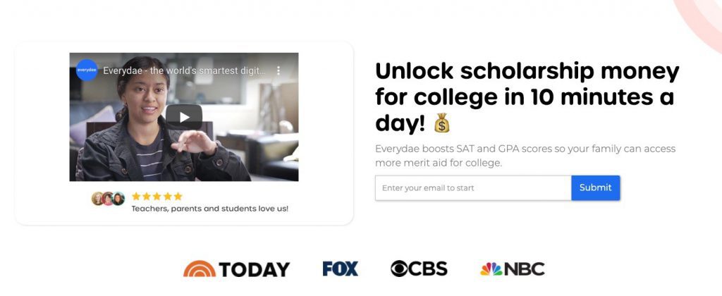
Let’s follow the formula to see if this works.
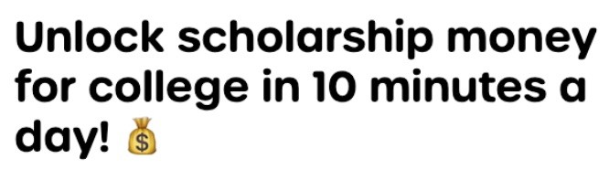
Unlock scholarship money for college in 10 minutes a day! That’s one amazing title, it directly tells you what you can do with Everydae right? This is a great example of explaining the value you provide.
Everydae boosts SAT and GPA scores so your family can access more merit aid for college. The second part, the subtitle, explains how they do it. This is also just one sentence but it’s very clear. This is how you should communicate your how.
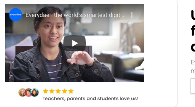
This YouTube video explain what Everydae is, how it works, and for whom it is. Videos are very visual, and it takes less energy (and space on your website) to watch them rather than reading all the content. That’s why it is smart to add some kind of visual. If you don’t have the resources to create a video, you might try pursuing an image that fits the message.

Have you noticed the trust of brands like Today, Fox, CBS, NBC, etc.? We buy things we trust. Providing social proof by showing brands that mentioned you, companies you’ve worked with, or testimonials/reviews from your users is a great way of earning trust.
Underneath the video is also a rating from teachers, parents, and students. They double it down in this header! We love ratings, right? The visitors of the page are way more likely to take action now.
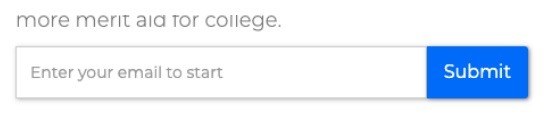
The last step would be for the visitor to take action. On the Everydae website, they use this clever input field to collect your e-mail and start straight away. Once you fill in your e-mail, they are able to put you in their marketing machine.
Other call-to-actions might be opening up some form where a quote can be requested, newsletter subscription or some way to get in touch/buy something. It depends on your marketing goals.
With this formula, the most important information is provided for a large part of your targeted audience. There might always be people that would like to have more information. For that case, you should definitely create a longer page than only the header providing more in-depth information. But always remembers to add multiple call-to-actions across the page so when the visitors are convinced, it’s easy to take action!
The first step is for optimizing your page, but we’ll now move on to the product ecosystem. That’s about how to convert your visitors into leads!
If I’m correct you’ve got multiple goals set for your website to see how it performs right? There are different types of goals. The first is micro-goals also known as soft conversions. Soft conversion can in the end lead to macro conversions. For example, subscribing to a newsletter or downloading a free whitepaper. Like I mentioned earlier there are also macro goals aka hard conversions. These are direct sales! This could be a subscription or just a one-time sale.
First, you’ve got to define what goals are set for certain pages. Landing pages are often focused on converting you, but try to figure out what the focus should have. You shouldn’t focus on multiple goals, but only one. Giving visitors many options will make them leave without taking any action.
According to the Hobson +1 choice effect, we need to offer people two choices in order to let them choose an option. Hobson’s choice effect is about to take it or leave it, if you give people one option it’s either yes or no … take it or leave it. When you give people another option to choose from, they are more likely to choose between the two options giving rather than leaving.
This also works for call-to-actions and is used across the internet widely. The only problem is that not many people align both options given with Hobson’s +1 choice effect to the same goal.
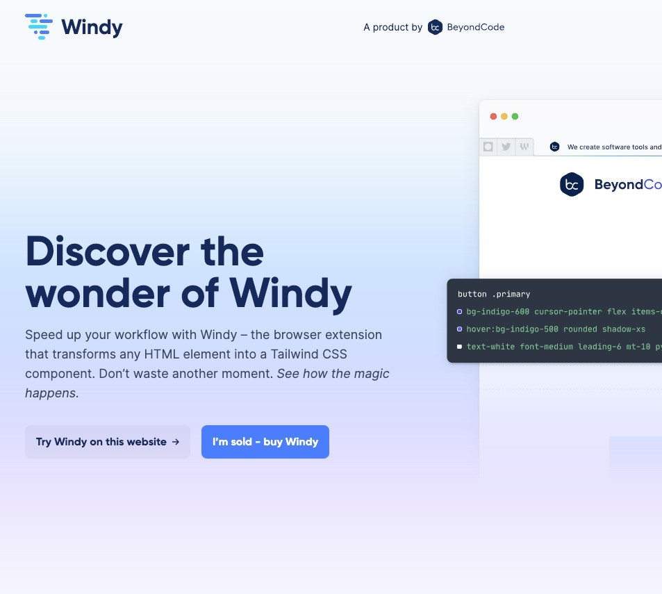
This example shows usewindy.com, there are two call-to-action there. Although these two buttons, you can definitely see which one has the focus. The end goal of both buttons is the same, convert the visitor to become a client.
Let’s continue with the landing page. In this scenario there is a call-to-action in the header, next to the call-to-action is a link (so this is the choice your visitors can make – rather than letting them leave). The first option is clear and often a button that stands out from the layout, this is straightforward.
The second option is a link, so it’s already a different style from the main button to keep the focus on the first option. If the second option would be to go to the about us page, that would be a mistake because you want people to stay at the landing page since that’s where you’re going to get a sale or lead.
The solution for the second option would be something like, watch our video or ‘I would like to have more information’. This second option won’t let people leave the page but rather scroll them to a new section to give more information and guess what there’s another call-to-action in case you’ve convinced the visitor to convert. Remember that in this case, you don’t want to give options, but only one call-to-action since you’ve already convinced the visitor to convert.
Choose wisely when to apply this technique. All call-to-actions should have the same end goal. Don’t let visitors subscribe to a newsletter that’s only sent once per year. Rather give them a whitepaper, in that case, that’s way more valuable. But make sure you’re using call-to-actions at the right moment! I’ve seen too many websites without call-to-actions.
The most underrated, but maybe the most important thing to do is experimentation. You’ve got to learn about your audience to make better decisions in the future and improve the conversion rate of anything on the website.
Nowadays, there are free tools like Google Optimize which can be used to easily do A/B tests. You could start by testing with content, try changing the headline, paragraph text, and the copy in the call-to-action for example. Let the A/B test run for 2 to 4 weeks and see what the results are!
Experimentation is about continuously learning about your audience. There aren’t magic tricks that will increase conversions on your website, since every targeted audience is different you’ve got to gather all the information and insights yourself.
A/B-test everything you can, from landing pages to sales pages, from newsletters to social media posts. Remember, while doing this you should document every single step otherwise you can’t share your full results with everybody within the company. It’s important to share all your learnings since that way everybody learns about the audience and even things like customer support might be able to use it … it also helps to get the dev team on board btw.
First, create a solid page with the formula from the first chapter and implement it. It’s something you should combine with the second chapter since both should align. Put it live and start testing! This will definitely increase conversions both short-term and long-term.
Feel free to reach out if you need any help or when you’re stuck! This will definitely improve lead generation for your website.
CRO specialist based in Groningen. I help companies increase revenue by optimizing their conversion funnel.
Schedule call